06 Mar 2015
Hi all,
Today I joined my colleague Jeroen in this Blogsite about Data.
Where Jeroen is the expert in BI, Big Data & Data warehousing I tend to focus on applications, databases, development & integration. And off course with a main focus on the Cloud with Azure.
I will try to keep you posted on all new developments with my personal view on it combined with my 25 years+ experience and day to day work at my customers.
So keep posted for my new posts!
Greets, Harry
10 Feb 2015
We are currently running a preview in the US of the new Power BI experience. This experience is not available yet to customers outside of the US. If you are outside of the US and want to get a trial of Power BI right now, you can set up a trial account for the “old” experience here. The new experience will be available outside of the US as well later.
20 Jan 2015
Azure Machine Learning is Microsoft’s cloud data mining and machine learning solution. It features a studio that is fully web based. One of the best features is integration with R through the ‘Execute R Script’ component. One of the best things of R is the plotting capability and I recently decided to try to make R plots from Azure ML studio. It is amazing how easy this works and it really brings the power of Azure ML together with the great exploration, plotting and data manipulation capabilities of R.
Here is a very simple sample I made:
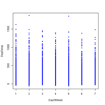
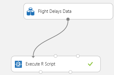
I used to Flight Delays sample dataset from Azure ML to make this. In the ML Studio you will need to create a new experiment and drag the ‘Flight Delays Data’ component to the canvas. The only other component you will need to drop on the canvas is ‘Execute R Script’ (I told you this was a very simple example). Drag a line from the data to the left most input port of the R script container like so:
Click on the R script component and edit the R script on the right. Here is my script:
dataset1 <- maml.mapInputPort(1);
data.set = rbind(dataset1);
with(data.set,plot(DepDelay ~ DayOfWeek, col = "blue", pch = 20));
aml.mapOutputPort("data.set");
This script gets the data from the input port and rbinds it into data.set. Then I executed a very simple plot using the plot base R package to create the plot shown above. The last line of this code is not even necessary but it was there by default.
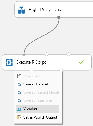
After running the experiment the plot can be seen by selecting the right output port of the ‘Execute R Script’ container and selecting ‘Visualize’:
The plot will be at the bottom of this page.
Pretty cool huh? Stay tuned for more as I will continue experimenting with R integration in Azure ML as well as other ML things.
13 Jan 2015
Just a bit over a week ago a new version of the Master Data Services Add-in for Excel was released. It is the 2014 release, which will also work for SQL Server 2012. Main benefit is up to 4x performance improvement without any server configuration changes. If you need extra performance you can get 2x extra by enabling Dynamic Content Compression in IIS on your MDS server.
Here is the download page: http://www.microsoft.com/en-us/download/details.aspx?id=42298.
06 Jan 2015
I would like to take this opportunity to wish you all a very happy and data-filled 2015. Thanks for visiting my blog this past year!
Data nerd as I am, I could not resist sharing with you this blogs annual stats report:
http://jetpack.me/annual-report/53080601/2014/
Enjoy!
 Dutch Data Dude